HR · Management
Designing shift management that handles the complexity, not the user.
I had the chance to work on a project aiming to become the top platform for team management — combining various tools in one spot, focusing on worker needs and streamlining workplace management. My role was to design a user-friendly shift management solution for both on-site and online work.
How can we design a shift planning system that remains user-friendly, while also addressing edge-cases for not very technical users?
Preparation Research. Exploring the niche.
Initially, I was unfamiliar with shift management for on-site jobs. So, my first step was to address this knowledge gap through secondary research — reading about the domain, studying how teams manage shifts today, and understanding the pain points workers and managers face daily.
This research phase shaped the entire design process that followed, ensuring every decision was grounded in real user needs rather than assumptions.
Design process emerged from what was found during the preparation phase:
Competition & Feature Research. Deciding what to include.
From my secondary research, I learned what to focus on when examining competitors' products. I looked at direct and indirect competitors, mapping which features existed, which were missing, and where users consistently struggled — turning insights into a clear feature inclusion framework.
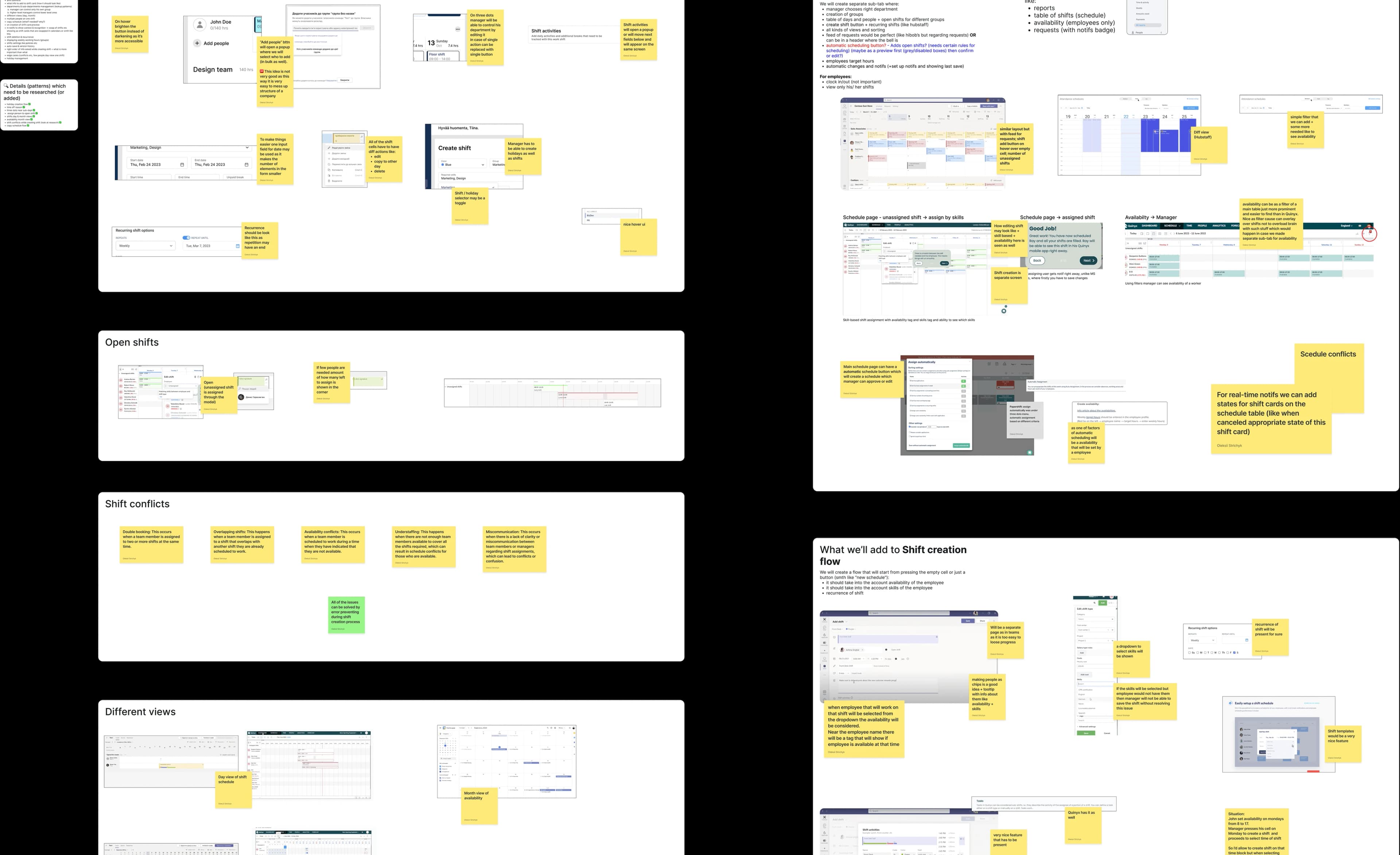
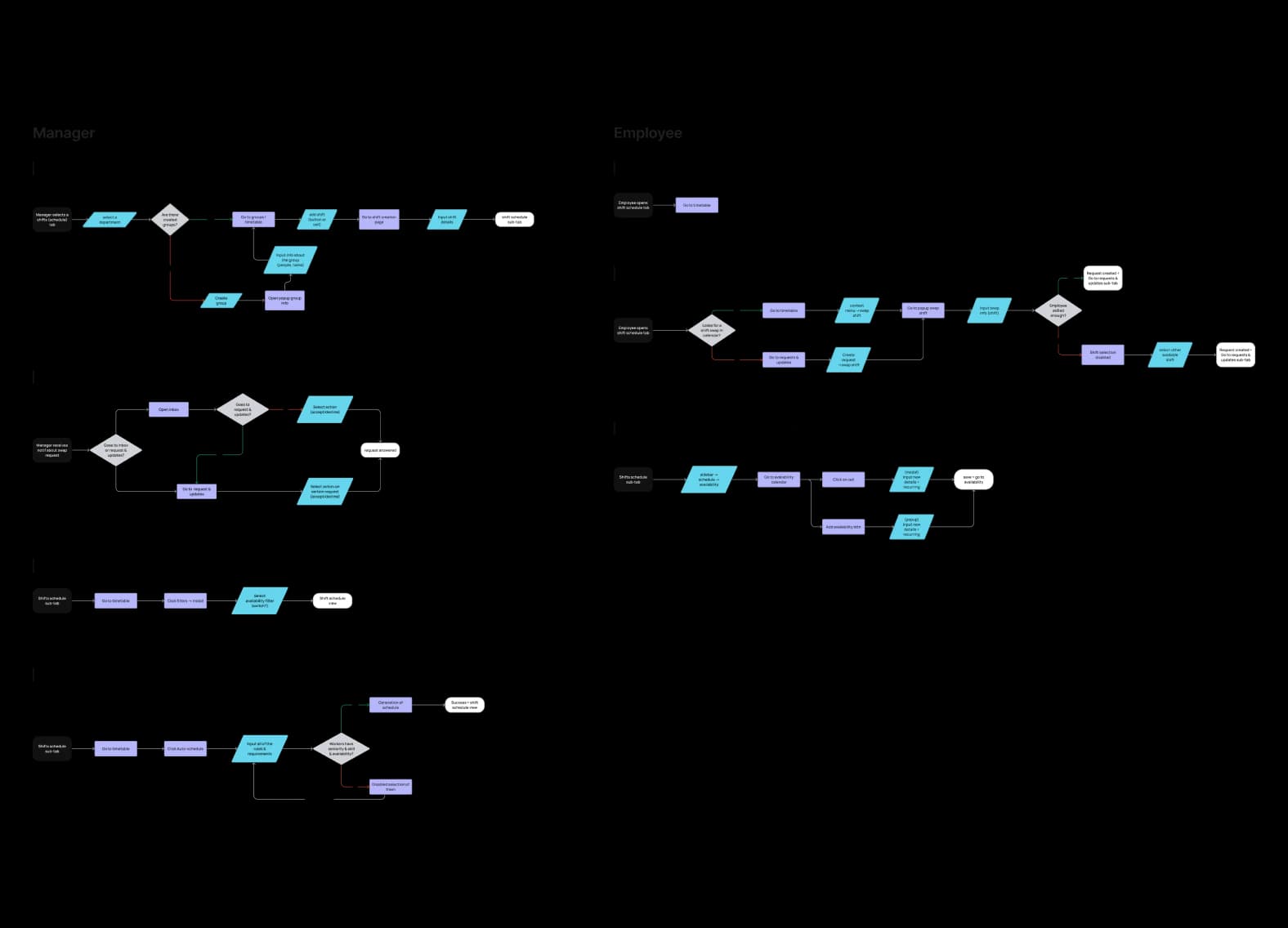
Wireframes & User Flows. Iterating toward clarity.
After deciding on what to include, it was time to visualise findings through initial wireframes. I iterated on user flows using "As a [who?], I want to [what?], so that I [why?]" statements for each flow — staying empathetic and goal-oriented throughout the process.
what do you think?
Most common question during the research phase — to stay as aligned to business and user needs as possible.
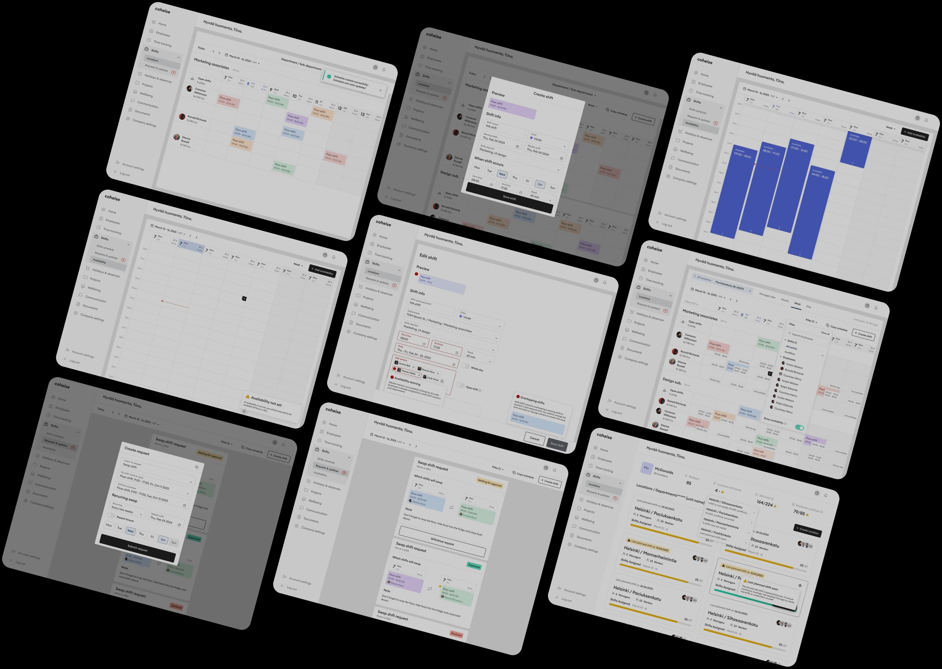
Here are some more wireframes. In general, it was pretty time consuming to iterate on wireframes for the best outcome, but it was definitely worth it.
User Flows
Wireframes
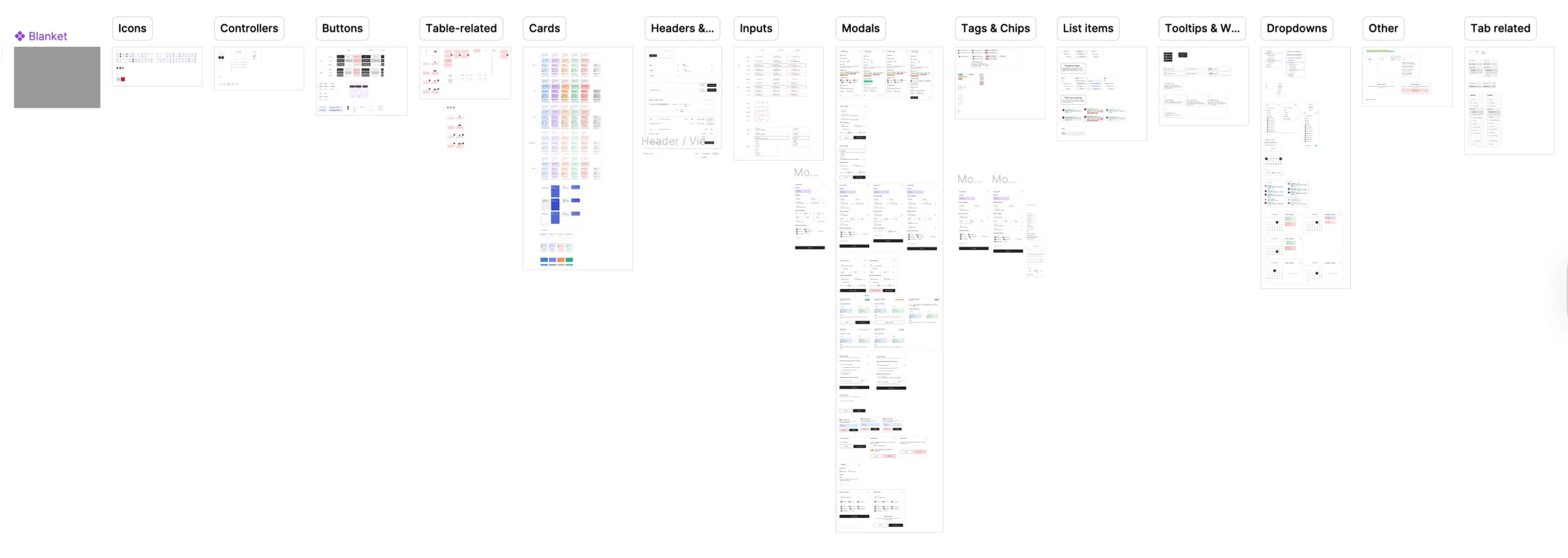
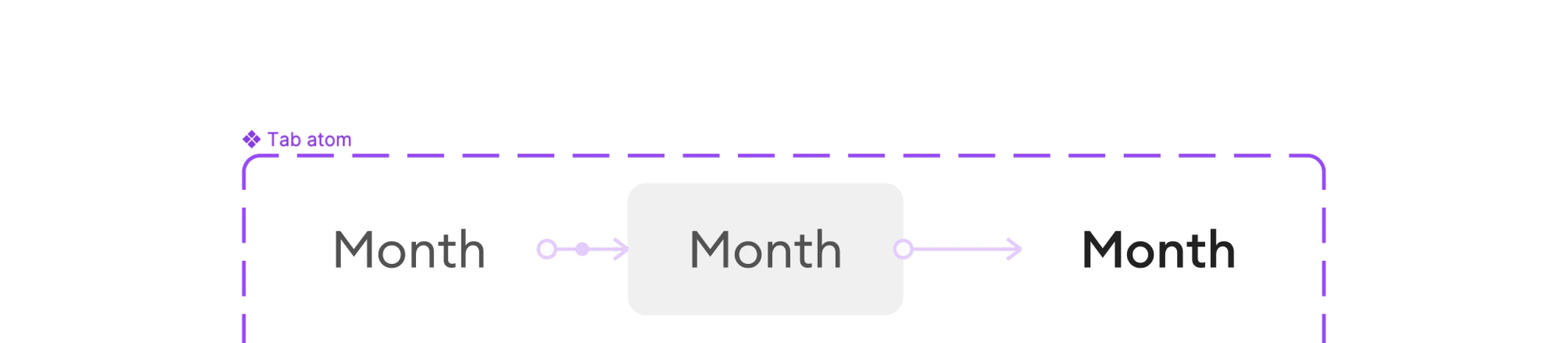
Design System. Building blocks for new designs.
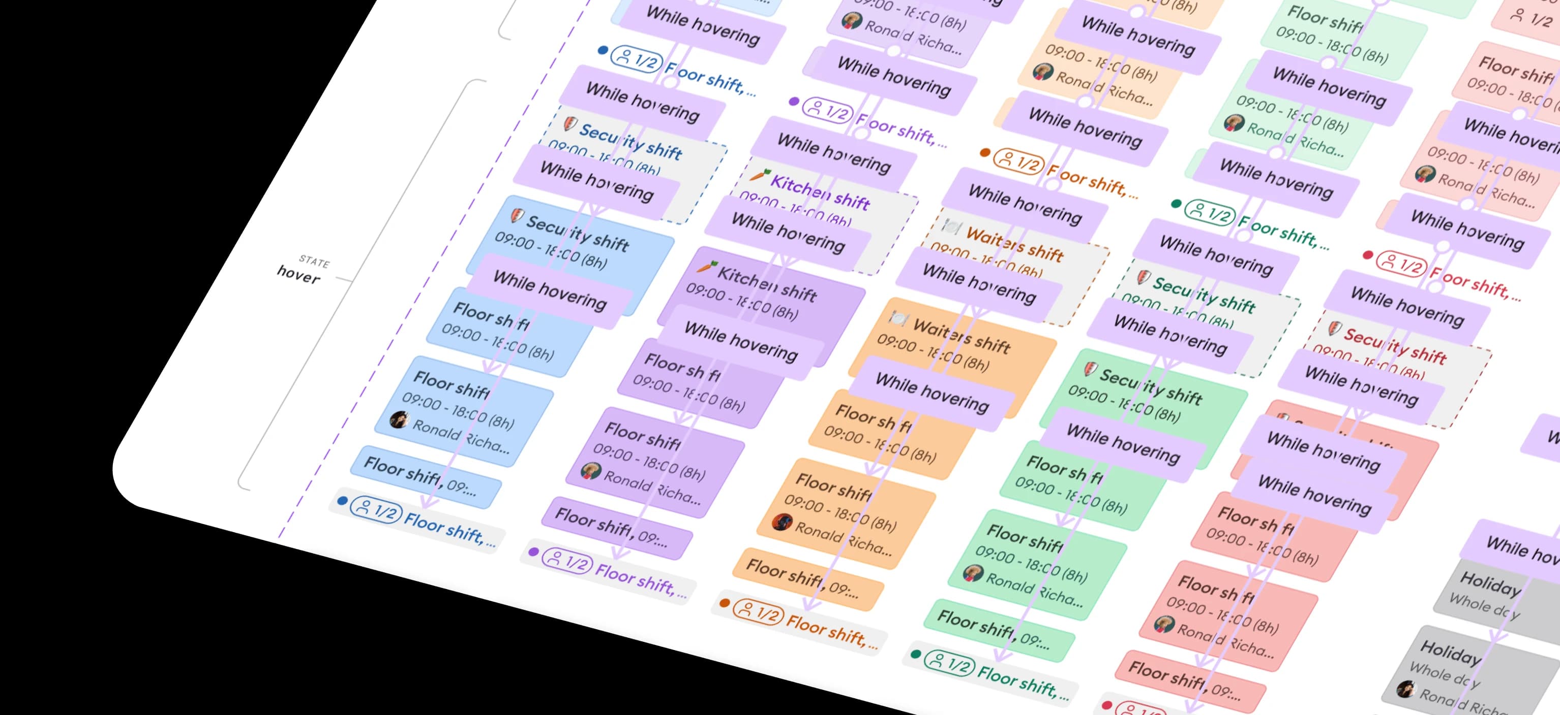
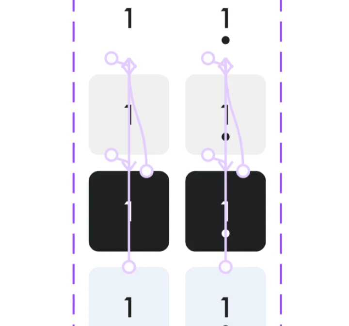
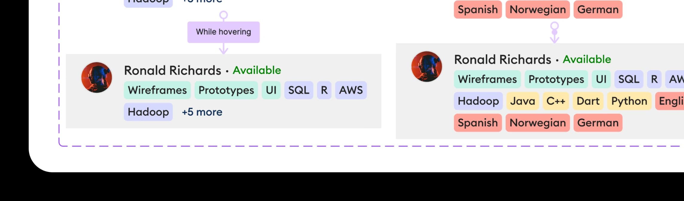
Creating many user flows led us to set up a design system. This increased design speed dramatically — some flows were finished in just one or two days. The system also enabled animated components for prototypes and gave developers a clean, structured handoff reference.
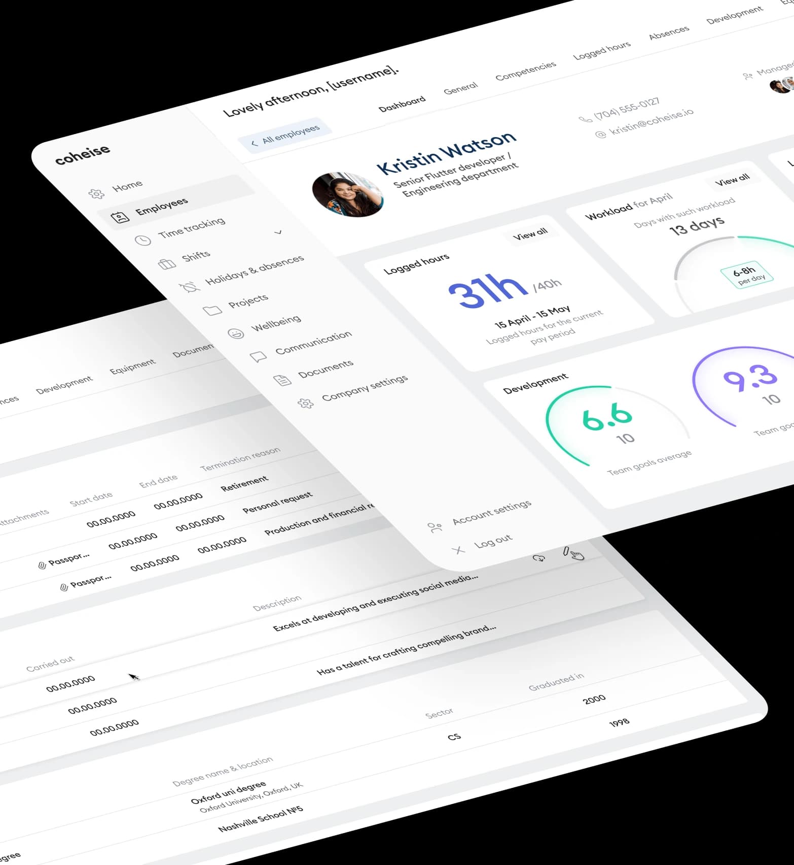
UX/UI Work. Helping users achieve their goals.
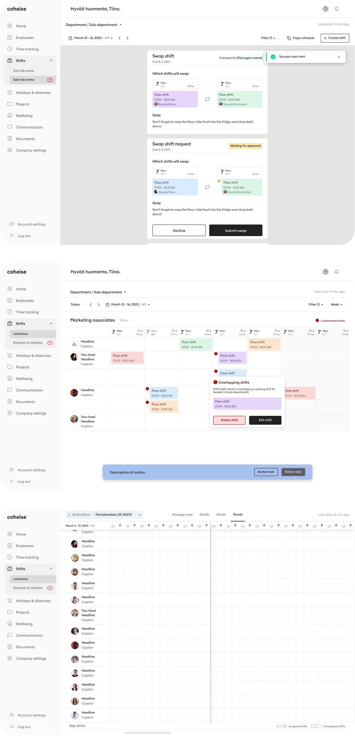
Designing everything as planned, I found that dealing with edge cases is one of the most challenging parts of UX work. It requires team effort and constant alignment to get the best results — every screen needed to account for exceptional states, not just the happy path.
01
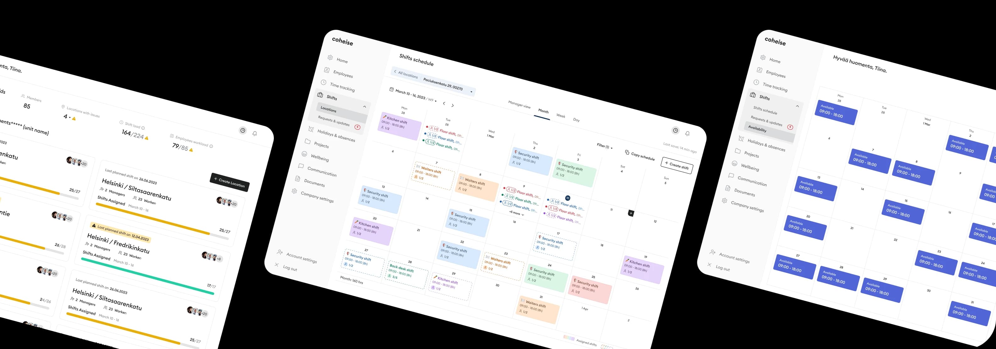
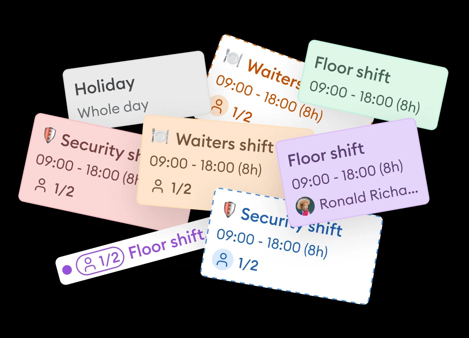
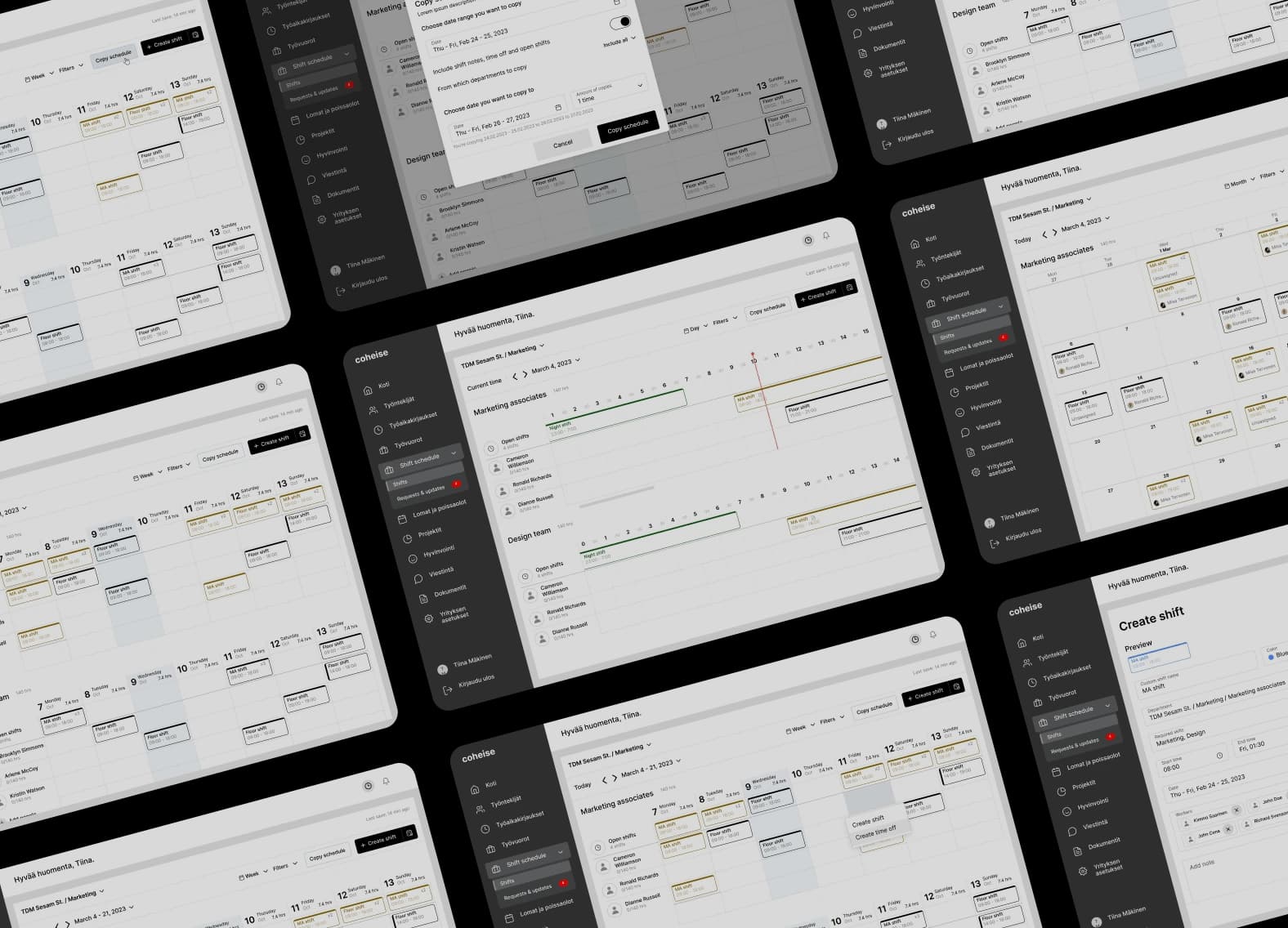
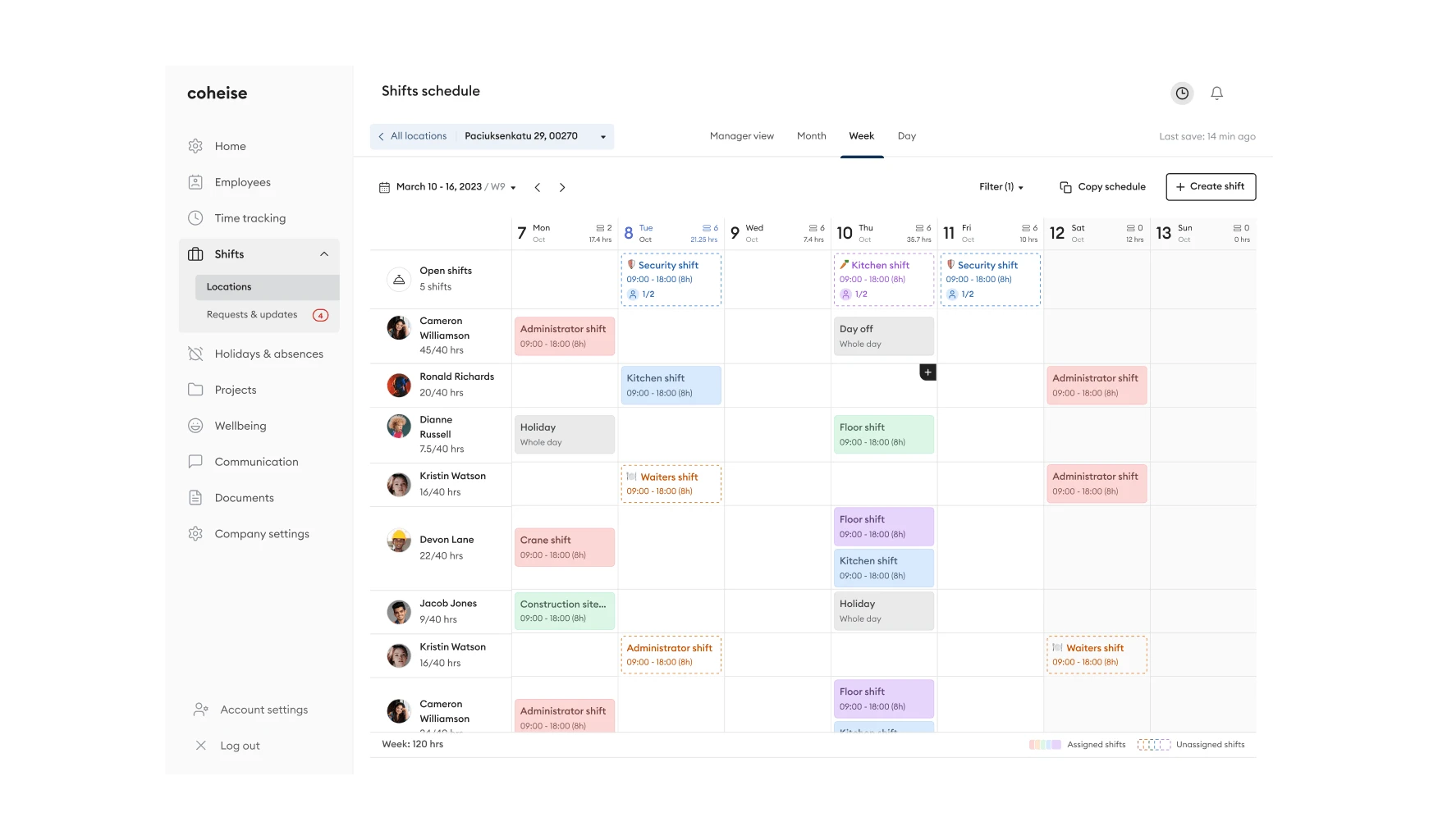
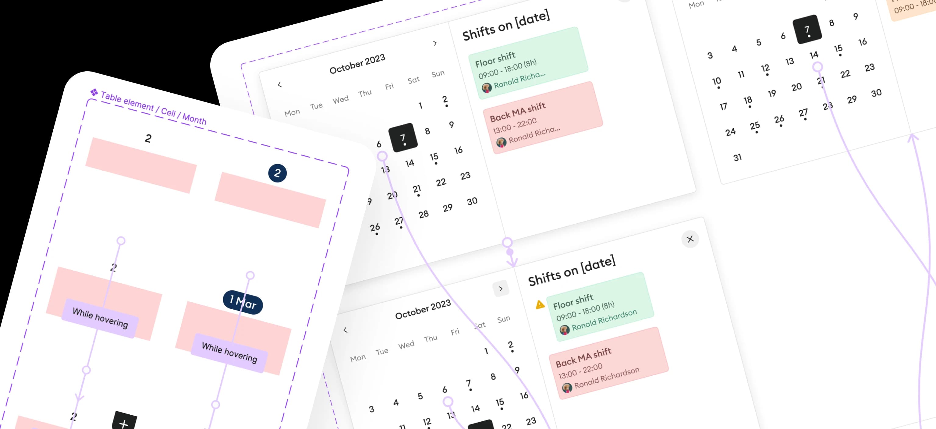
Schedule Screen
The main challenge on this page was to display an easy-to-scan schedule that would already be familiar to many. It needed to work across locations, time ranges, and user roles — while staying actionable at a glance.
02
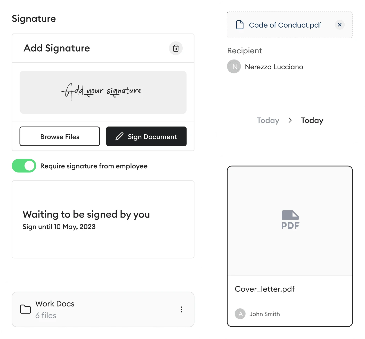
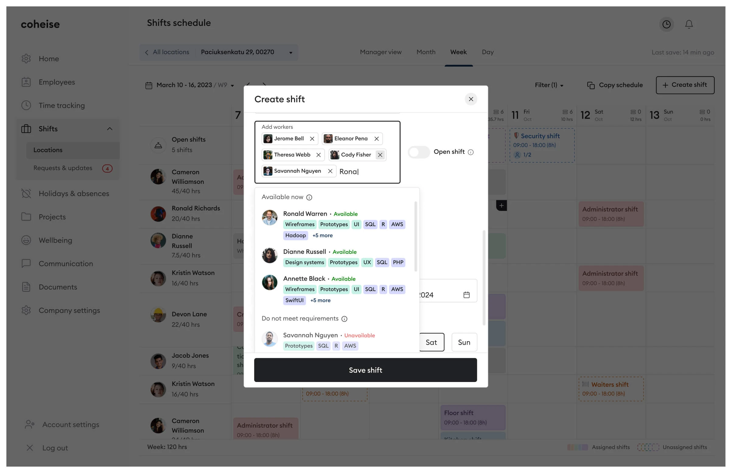
Shift Creation Modal
Shift creation involves many variables that can cause errors and conflicts. The best way to avoid them is to prevent them at input — guiding users through validation in real time rather than surfacing errors after submission.
03
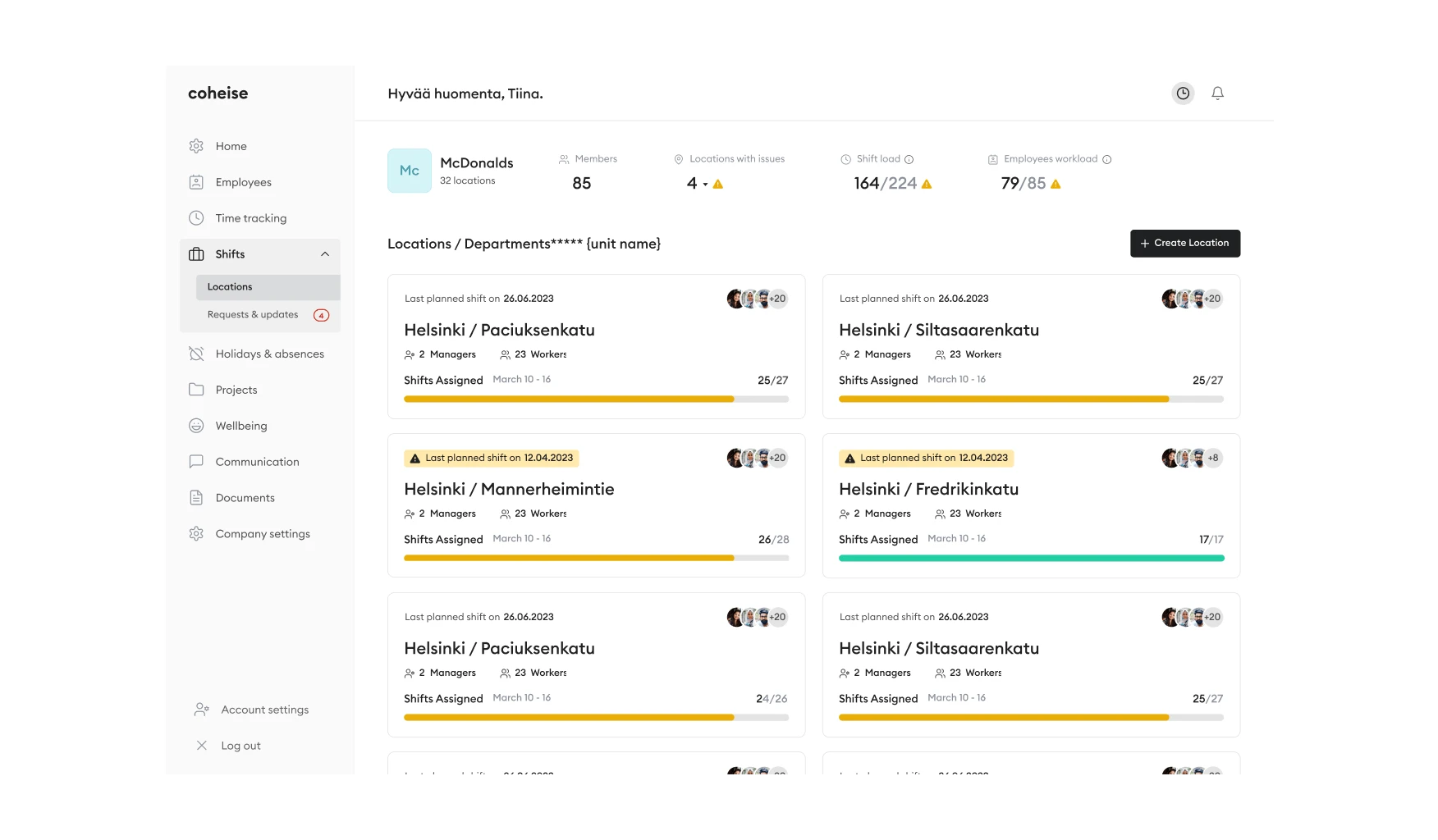
Locations View
Big companies usually have many different locations to manage. From here, they can see at a glance if any location requires action, along with relevant statistics and warnings for each of them.
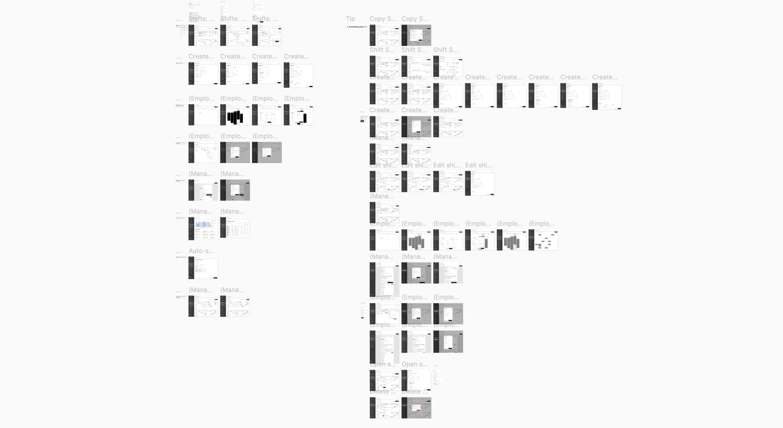
~125
screens created to enhance users' experience within the product
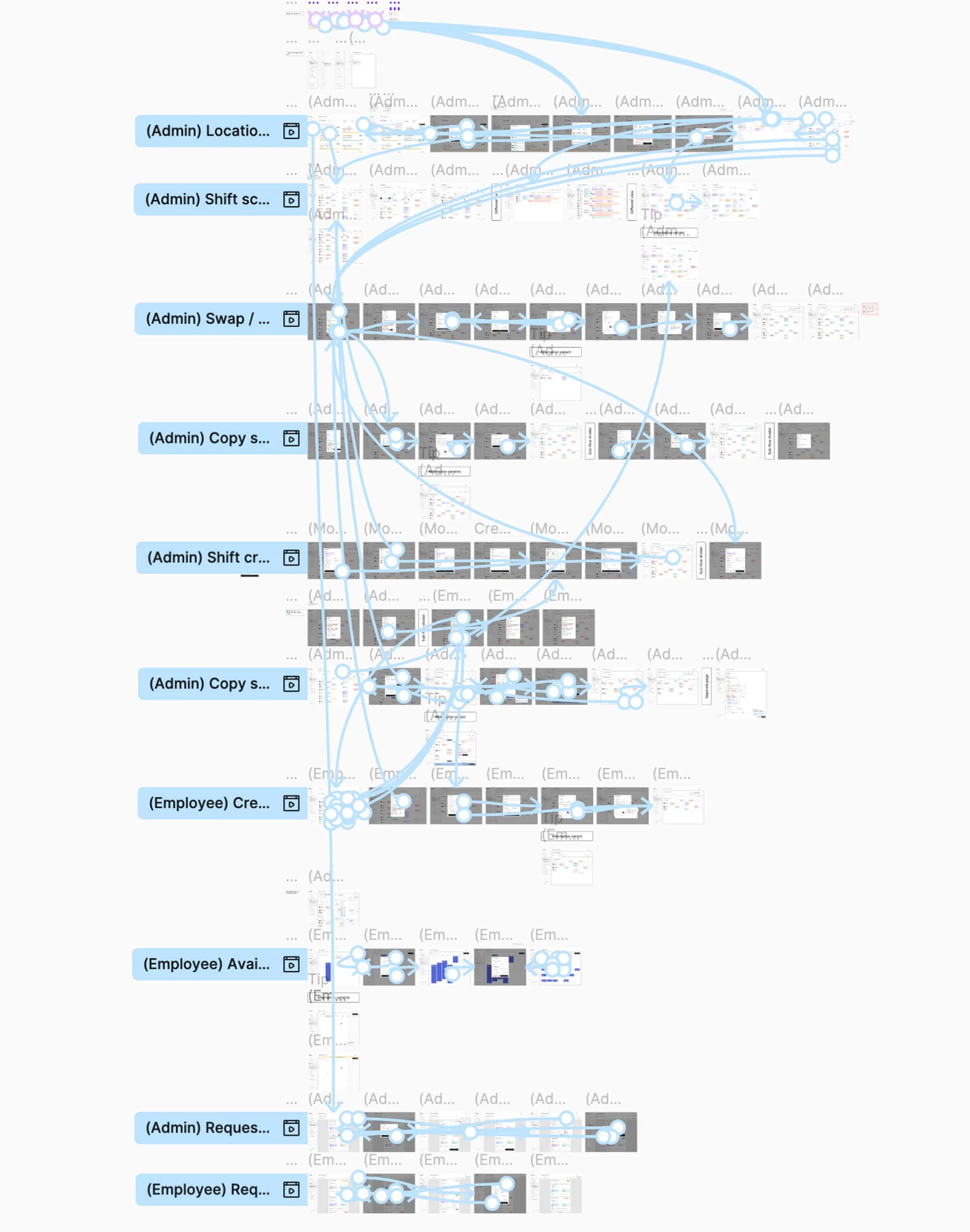
Prototypes. Validating before handing off.
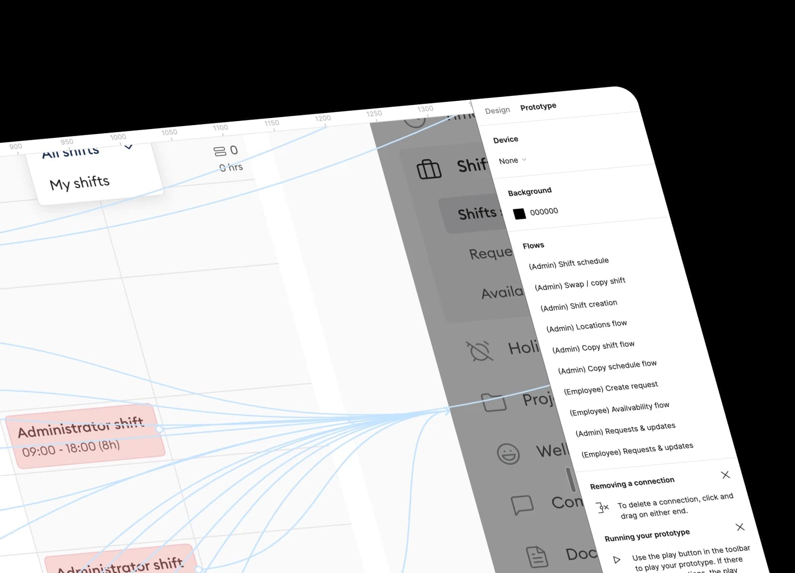
After the main design phase, I turned to prototyping flows to quickly review and refine what was created before handing off to the team. High-fidelity prototypes with animated components made it possible to run meaningful user testing sessions and surface issues early.
120+
animated components created for immersive prototypes
Reflection.
Integrating complex functionality from scratch is a process not without caveats.
Working on such a project was an incredibly rewarding experience that helped me improve my design and problem-solving skills significantly. I was proud to work alongside a talented team and contribute meaningfully to a product with real user impact.
What value have I provided for business and users?
Upgraded Design System
Delivered a scalable component library that meaningfully accelerated both design iterations and developer handoff.
Edge-Case Coverage
Mapped and solved non-obvious user scenarios that simpler products miss — crucial for managing complex shift logistics.
User-Centered Flows
All 125+ screens were designed around real user goals and mental models, keeping familiar patterns (e.g. Office-style scheduling) front of mind.
Stakeholder Alignment
Regular 'what do you think?' check-ins kept business and user needs in sync throughout the entire design process.
High-Fidelity Prototypes
120+ animated components enabled immersive user testing sessions and surfaced real issues before any development began.
Design Velocity
A structured process and component system allowed completing complex flows in just one to two days — without sacrificing quality.
That was a genuinely rewarding project.
I loved working on Coheise and with that team. Designing a product this complex end-to-end — from research through high-fidelity prototypes — pushed me to grow fast and think at a systems level. I came out a substantially better designer.